Page 32 - USI Newsletter No.94
P. 32

English                                                                               英文補給站
          Classroom                                                                                                                                                                                                               NO.94


          聽眾提問                                                                                                                        除了這三種圖之外其實還有很多圖表可以做使用,其他不同功能圖表如下:
                                                                                                                                      Here are some other types of charts with their respective functions:
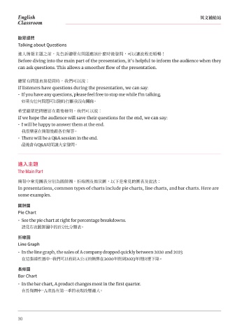
          Talking about Questions
          進入簡報主題之前,先告訴聽眾有問題應該什麼時後發問,可以讓流程更順暢!
          Before diving into the main part of the presentation, it's helpful to inform the audience when they                                                     Flow chart 流程圖       Pyramid Diagram 金字塔圖
          can ask questions. This allows a smoother flow of the presentation.

                                                                                                                                                                     Table 表格           Organization chart 組織圖
          聽眾有問題直接提問時,我們可以說:
          If listeners have questions during the presentation, we can say:
          •  If you have any questions, please feel free to stop me while I'm talking.

           如果有任何問題可以隨時打斷我沒有關係。
                                                                                                                                      數據分析說明
          希望聽眾把問題留在最後發問,我們可以說:                                                                                                        Analysis and Explanations
          If we hope the audience will save their questions for the end, we can say:
          •  I will be happy to answer them at the end.                                                                               在圓餅圖中,表達數據常用 segment/slice 來表示比例區塊,例如:
                                                                                                                                      In a pie chart, a slice or a segment is commonly used to represent the proportions of the data.
           我很樂意在簡報後跟各位解答。
          •  There will be a Q&A session in the end.                                                                                  •  The red slice has just less than half of the votes.
                                                                                                                                        紅色區塊拿到大約接近一半的票數。
           最後會有Q&A時間讓大家發問。
                                                                                                                                      •  The yellow slice is in second, with about a third of the votes.

                                                                                                                                        黃色區塊第二,大約是三分之一。
          進入主題
          The Main Part                                                                                                               在折線圖及在長條圖中,經常表示一段時間的數據或走勢,例如:
                                                                                                                                      The line charts and bar charts are used to shown the data or the trends over a period of time.
          簡報中常見圖表分別為圓餅圖,折線圖及條狀圖,以下是常見的圖表及說法:                                                                                          •  The bar graph shows sales of Samsung phones from January to June last year.
          In presentations, common types of charts include pie charts, line charts, and bar charts. Here are                            這張長條圖顯示去年一月到六月間三星手機的銷售狀況。
          some examples.
                                                                                                                                      在圖表中做比較時如以下例句:
          圓餅圖                                                                                                                         When comparing in the chart, as in the following example sentences:
                                                                                                                                      •  Both Team A and Team B are going down, but Team B has a greater change.
          Pie Chart
          •  See the pie chart at right for percentage breakdowns.                                                                      A組和B組表現皆為下跌,但B組下跌更明顯。

           請見右表圓餅圖中的百分比分類表。                                                                                                           •  The sales online make steady gains even though the sales in shops declines slightly.
                                                                                                                                        雖然門市銷售呈現些微的下降,但線上銷售穩定成長。
          折線圖
          Line Graph                                                                                                                  除了以上常見的句型之外,說明圖表數據時,有很多好用的動詞,經常在說明細節時使用:
          •  In the line graph, the sales of A company dropped quickly between 2020 and 2023                                          In addition to the common sentence structures mentioned above, there are several useful verbs
                                                                                                                                      frequently used to provide more precise and informative explanations of the data in the chart. Here
           在這張線性圖中,我們可以看到A公司的銷售在2020年間到2023年間快速下降。
                                                                                                                                      are some examples:
          長條圖
                                                                                                                                      •  上升/成長:Rise/go up/increase/grow/ascend/make a steady gain
          Bar Chart
                                                                                                                                      •  持平/不變:Stay the same
          •  In the bar chart, A product changes most in the first quarter.
                                                                                                                                      •  下降/減少/衰退:Fall/go down/decrease/drop/decline
           在長條圖中,A產品在第一季的表現改變最大。


          30                                                                                                                                                                                                                        31
   27   28   29   30   31   32   33   34   35   36   37